Dashboards
Dashboards are the assembly layer of Analytics 360 — they bring visualizations together into structured, resizable layouts that can be viewed, filtered, and presented as a single cohesive page. Each dashboard is a grid of rows and columns populated with visualizations, with a global filter bar that cascades across all contained widgets.
Overview
The Dashboards tab operates in three modes: a list view showing every dashboard you have saved, a designer view for building and editing dashboard layouts, and a preview view for fullscreen presentation.
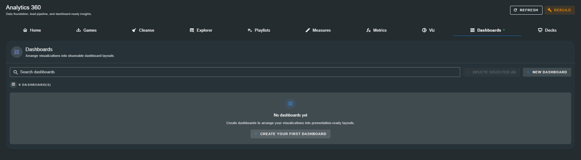
List View
When dashboards exist, the list view displays a table with the following columns:
| Column | Description |
|---|---|
| Name | The dashboard name. Click any row to view the dashboard. |
| Description | An optional description of the dashboard's purpose or audience. |
| Updated | The timestamp of the last save. |
| Actions | Kebab menu (⋮) with View, Edit, and Delete options. |
Above the table, a search bar filters dashboards by name in real time. A count badge shows the total number of saved dashboards. Checkboxes on each row enable bulk delete.
Empty State
When no dashboards have been saved, the page displays a prompt: "Create dashboards to arrange your visualizations into presentation-ready layouts." with a Create Your First Dashboard button.
Dashboard creation requires the Analyst Elite package. Users on lower tiers see an upgrade prompt directing them to the Accounts Portal. :::
The Dashboard Designer
Click New Dashboard (or Edit on an existing dashboard) to open the fullscreen designer. The designer is a drag-and-drop layout editor where you build dashboards from rows, columns, and components.
Designer Toolbar
The top toolbar provides:
| Control | Description |
|---|---|
| Close (✕) | Exit the designer. Prompts if there are unsaved changes. |
| Dashboard Name | A text field for naming the dashboard. Appears in the list view and preview header. |
| Description | An optional text field describing the dashboard. |
| Autosave Indicator | A chip showing Saving... (with spinner) or Saved (with checkmark) as the layout auto-saves. |
| Save | Manually trigger a save. |
| Preview | Open the fullscreen preview view to see the dashboard as it will appear to viewers. |
Layout System
Dashboards use a 12-column grid system. The layout is hierarchical:
Dashboard
  └── Row (root)
       ├── Col (e.g. 4-col span)
       │    ├── Component (KPI)
       │    └── Component (Chart)
       ├── Col (e.g. 8-col span)
       │    └── Component (Position Map)
       └── Col (e.g. 12-col span)
            └── Row (nested)
                 ├── Col (6-col span) → Component
                 └── Col (6-col span) → Component
Rows
Rows are horizontal containers that hold columns. The root row cannot be deleted. Nested rows can be created inside columns for more complex layouts.
Each row has a context menu (⋮) with:
- Add Container — Add a new column to this row
- Move Up / Move Down — Reorder rows within their parent column
- Delete Row — Remove the row and all its contents
Columns (Containers)
When adding a container, you configure:
| Setting | Description |
|---|---|
| Span Size (Desktop) | How many of the 12 grid columns this container occupies on large screens (1–12). |
| Offset (Desktop) | How many columns to skip before this container starts. |
| Span Size (Mobile) | Grid span on mobile devices. Recommended: 12 for full-width. |
| Offset (Mobile) | Offset on mobile devices. Recommended: 0. |
The total of span size + offset must not exceed 12. An inline validation message warns if the combination is invalid.
Components
Each column can hold one or more components. Currently supported component types:
| Component | Description |
|---|---|
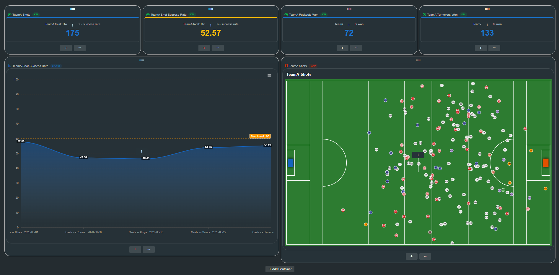
| Visualization | Embeds any saved visualization (KPI, Table, Chart, Position Map, Event Source) into the dashboard. Displays the visualization's type chip and name in a header bar above the rendered content. |
| Embedded Image | Embeds an image from a URL. Useful for adding logos, sponsor graphics, or external charts. |
Adding a Visualization
Empty columns display a placeholder: "Add a component to this container". Drag a visualization from the sidebar or use the component menu to place one.
Each visualization component shows:
- A header bar with the visualization type icon, name, and type chip (colour-coded)
- The fully rendered visualization, identical to its standalone preview
- A hover overlay with a context menu for Edit (swap visualization) and Delete (remove from column)
Drag and Drop
Components can be reordered within a column by dragging. On desktop, a drag handle icon appears when hovering between components. Drag a component to a new position or into another column's drop zone to rearrange the layout.
Viewing a Dashboard
Click View from the list (or click a dashboard row) to open the dashboard in view mode. The view mode presents the dashboard with:
Global Filter Bar
A filter bar at the top of the dashboard applies to all contained visualizations simultaneously:
| Filter | Description |
|---|---|
| Team | Select a team to filter all visualizations. Triggers cascading updates to Games and Players. |
| Games | Multi-select games, automatically filtered to the selected team's fixtures. |
| Players | Multi-select players, filtered by the selected team. |
| Periods | Multi-select periods (1–8) to focus on specific game segments. |
Filters cascade: selecting a team automatically narrows the available games and players. Clearing a filter widens the scope back to all available data.
Dashboard Layout
The dashboard renders exactly as designed — rows, columns, and components at their configured sizes. All visualizations respond to the global filter, updating their data in real time as filters change.
Preview
Click Preview from the designer toolbar to open a fullscreen presentation view:
- Dashboard name displayed as a centred heading
- Edit button (pencil icon) to jump back to the designer
- Close button to return to the designer
- Full rendering of the dashboard with the global filter bar active
The preview is designed for presentation scenarios — share your screen, connect to a projector, or use it for team review meetings.
Managing Dashboards
Editing
Use the kebab menu (⋮) → Edit to open a dashboard in the designer. Make layout changes, add or remove components, adjust column spans, and save.
Viewing
Use View from the kebab menu, or click any dashboard row, to open the read-only view mode with the global filter bar.
Deleting
Use the kebab menu (⋮) → Delete to remove a dashboard. A confirmation dialog asks you to confirm. This action cannot be undone.
Bulk Delete
Check multiple rows in the list view and click Delete Selected (n). A confirmation dialog shows the count. All selected dashboards are removed.
Searching
The search bar at the top of the list filters dashboards by name in real time.
Unsaved Changes
If you close the designer or navigate away with unsaved changes, a dialog warns you: "You have unsaved changes. Are you sure you want to discard them?" Choose Discard to lose changes or Keep Editing to return to the designer.
How Dashboards Connect
Dashboards are the top-level consumer in the Analytics 360 data model — they assemble visualizations into complete analytical views:
Tagged Events  →  Measures  →  Calculated Metrics  →  Visualizations  →  Dashboards
                                                                        →  Decks
A dashboard can contain any number of visualizations of any type. A single visualization can appear in multiple dashboards. The global filter bar provides a unified filtering experience across all contained widgets, making dashboards ideal for team review sessions, match analysis, and recurring report views.
Next Steps
With dashboards defined, you can take them into presentation formats:
- Decks — Build presentation decks combining dashboards and visualizations with narrative slides for meetings and reviews