Visualizations
Visualizations are the presentation layer of Analytics 360 — they transform measures and calculated metrics into interactive charts, tables, KPIs, position maps, and event source breakdowns. Each visualization is a self-contained, reusable widget that can be embedded in dashboards, exported for presentations, and previewed with live filters.
Overview
The Visualizations tab operates in two modes: a list view showing every visualization you have defined, and an editor view for creating or modifying individual visualizations.
List View
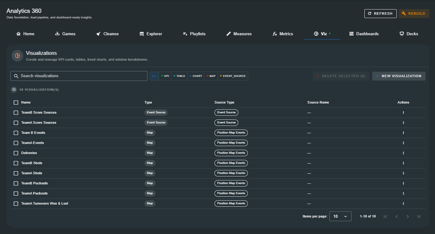
When visualizations exist, the list view displays a table with the following columns:
| Column | Description |
|---|---|
| Name | The human-readable name of the visualization. Click any row to open the editor. |
| Type | The visualization type — KPI, Table, Chart, Map (Position Map), or Event Source. Colour-coded chip. |
| Source Type | The data source powering the visualization — Calc. Metric, Measure, or the raw data source name. |
| Source Name | The name of the specific calculated metric or measure, or a dash for tables. |
| Actions | Kebab menu (⋮) with Edit, Copy, Delete, and Preview options. |
Above the table, a search bar filters visualizations by name. A type filter row lets you toggle between All, KPI, Table, Chart, Map, and Event Source. A count badge shows the total number of visualizations. Checkboxes enable bulk delete with dependency checking.
Empty State
When no visualizations have been defined, the page displays a prompt to create your first one — explaining that visualizations bring your measures and metrics to life in charts, tables, and KPIs.
Visualization Types
Analytics 360 supports five visualization types:
| Type | Description | Best For |
|---|---|---|
| KPI | A single-metric card with configurable colour (custom, traffic light). | High-level performance indicators, scoreboards |
| Table | A multi-column data table with sortable rows, configurable row grain, and per-metric rollup. | Player comparisons, team stat sheets, game-by-game breakdowns |
| Chart | Bar, stacked bar, pie, donut, line, or area chart with group-by axes and colour schemes. | Trends, distributions, category comparisons |
| Position Map | A sports field/pitch overlay showing event positions as shapes with optional player labels. | Shot charts, puckout maps, turnover location analysis |
| Event Source | A breakdown showing where scoring chances originate, with timeline chips and player involvement. | Score source analysis, attacking pattern identification |
Start with a KPI or Chart — these connect directly to measures or calculated metrics and produce immediate visual results. Tables and Event Sources unlock deeper, multi-dimensional analysis. :::
Creating a Visualization
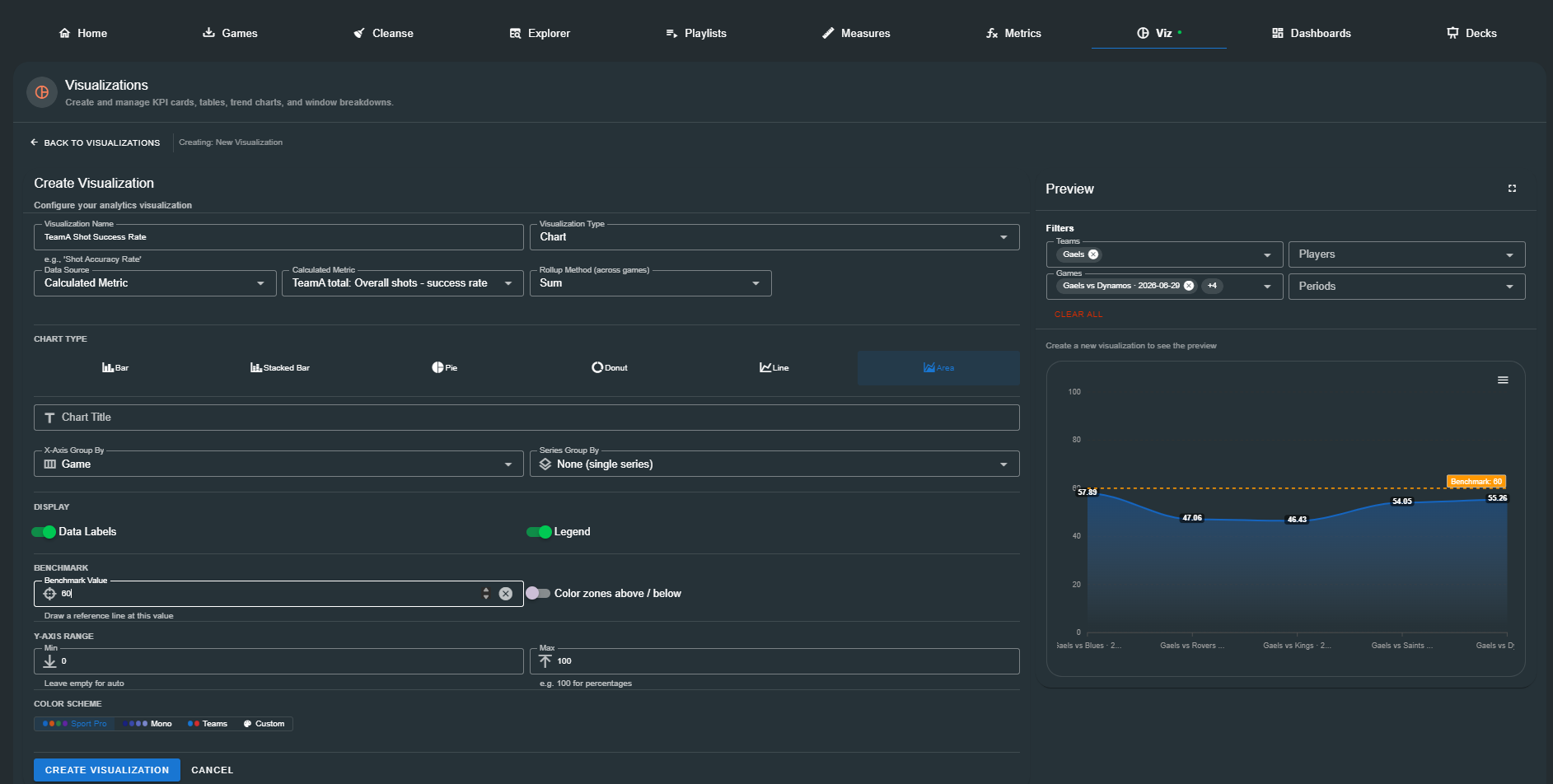
Click New Visualization (or Create Your First Visualization when the list is empty) to open the editor. The editor is split into two panels: a configuration panel (left) and a live preview panel (right).
Core Settings
Every visualization, regardless of type, starts with these common fields:
| Field | Description |
|---|---|
| Visualization Name | A descriptive name (e.g. "TeamA Shot Success Rate"). Required. |
| Visualization Type | Select from KPI, Table, Chart, Position Map, or Event Source. |
| Data Source | (KPI and Chart only) — Calculated Metric, Measure, Total Events, Top Events, or Trend. |
| Calculated Metric / Measure | (when using calculated metric or measure data source) — The specific metric or measure to visualize. |
| Rollup Method | (KPI and Chart only) — Sum (total across selected games) or Average (mean across games). |
When a measure is selected as the data source, an info alert displays a summary of the measure's configuration (event names, team filter, next event filters, label options).
KPI Visualization
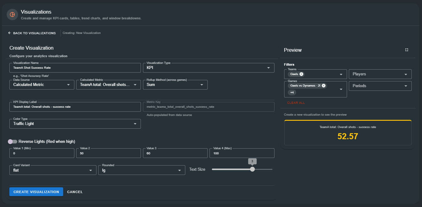
A KPI displays a single numeric value in a styled card. It is ideal for dashboards and scoreboards.
KPI Configuration
| Setting | Description |
|---|---|
| KPI Display Label | The label shown above the value (e.g. "Shot Success Rate"). |
| Metric Key | Auto-populated from the selected data source. Read-only. |
| Color Type | Custom Color (solid colour picker) or Traffic Light (value-based zone colours). |
| Reverse Lights | When enabled, red means high values and green means low values (useful for negative metrics like turnovers). |
| Traffic Light Values | Four thresholds (v1 ≤ v2 ≤ v3 ≤ v4) defining three colour zones: red/amber/green. |
| Card Variant | Material Design card style: flat, tonal, outlined, plain. |
| Rounded | Corner rounding: xs, lg, xl, pill, circle, shaped. |
| Text Size | Slider from 1 (small) to 4 (large). |
Traffic Light Zones
Values are coloured based on their position within the four thresholds:
| Range | Default Color (normal) | Color (reversed) |
|---|---|---|
| ≤ v2 | Red | Green |
| v2 → v3 | Amber | Amber |
| ≥ v3 | Green | Red |
The card's top border matches the active colour, providing an immediate visual cue even before reading the number.
Table Visualization
A table displays multi-dimensional data with configurable columns, row granularity, and sort rules. It is the workhorse for player comparisons and team stat sheets.
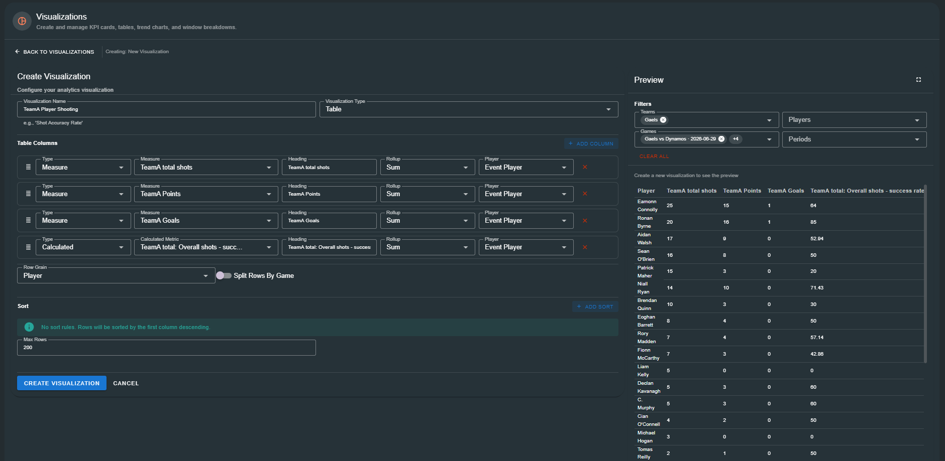
Table Columns
Each column is defined by:
| Setting | Description |
|---|---|
| Type | Measure (references a measure by its aggregation) or Calculated (references a calculated metric). |
| Measure / Calculated Metric | The specific measure or metric to display in this column. |
| Heading | The column header text (auto-populated from the measure/metric name). |
| Rollup | Sum or Average — applied per-metric so different columns can use different aggregation methods. |
| Player | (when rows include players) — Event Player or Next Event Player for attribution. |
Columns can be reordered by drag-and-drop.
Row Configuration
| Setting | Description |
|---|---|
| Row Grain | Player, Team, or Game — determines what each row represents. |
| Include Player Column | When Row Grain is not Player, optionally add a player dimension column. |
| Split Rows By Game | When Row Grain is not Game, create separate rows per game for each entity. |
| Max Rows | Limit the number of displayed rows (1–1000). |
Sort Rules
Multiple sort rules can be added and reordered by drag-and-drop:
| Setting | Description |
|---|---|
| Column | Which column to sort by — any dimension or metric column. Options update dynamically based on row grain and included columns. |
| Direction | Ascending or Descending. |
If no sort rules are defined, rows are sorted by the first metric column in descending order.
Chart Visualization
Charts transform data into visual patterns with configurable chart types, grouping dimensions, colour schemes, and benchmark lines.
Chart Types
| Type | Description |
|---|---|
| Bar | Vertical bar chart — compare categories side by side. |
| Stacked Bar | Vertical stacked bars — show category composition. |
| Pie | Proportional slices of a whole. |
| Donut | Pie with a cut-out centre showing the total. |
| Line | Connect data points to show trends over time or categories. |
| Area | Filled line chart with gradient shading. |
Grouping
| Setting | Description | Options |
|---|---|---|
| X-Axis Group By | What appears along the horizontal axis. | Team, Player, Game, Event Name |
| Series Group By | What creates separate data series (bars/lines). | None, Team, Player, Game, Period, Minute Window |
| Minute Window | (when minute_window is selected) — Window size in minutes. | 5, 10, 15, 20 min |
Pie and donut charts only support a single series (the X-Axis categories become the slices).
Display Options
| Setting | Description |
|---|---|
| Data Labels | Show numeric values on bars/slices/points. |
| Legend | Show a colour legend at the bottom. |
| Horizontal Orientation | (bar/stacked bar only) — Display bars horizontally. |
Benchmark
(Line and Area charts only)
| Setting | Description |
|---|---|
| Benchmark Value | Draw a dashed orange reference line at this Y-axis value. |
| Color zones above / below | (Area only) — Shade above the benchmark green and below it red. |
Y-Axis Range
| Setting | Description |
|---|---|
| Min | Force the Y-axis minimum (leave empty for auto). |
| Max | Force the Y-axis maximum (e.g. 100 for percentages). |
Colour Scheme
| Scheme | Description |
|---|---|
| Sport Pro | A curated palette of four bold, sport-friendly colours. |
| Monochrome | Four shades of a single hue for a clean, professional look. |
| Teams | Two-colour scheme using the configured Team A and Team B colours. |
| Custom | Define up to six custom HEX colours with a colour picker. |
Position Map Visualization
A position map overlays event positions onto a sports field or pitch using Konva canvas rendering. It shows where events occurred through shape markers, player labels, and connection lines.
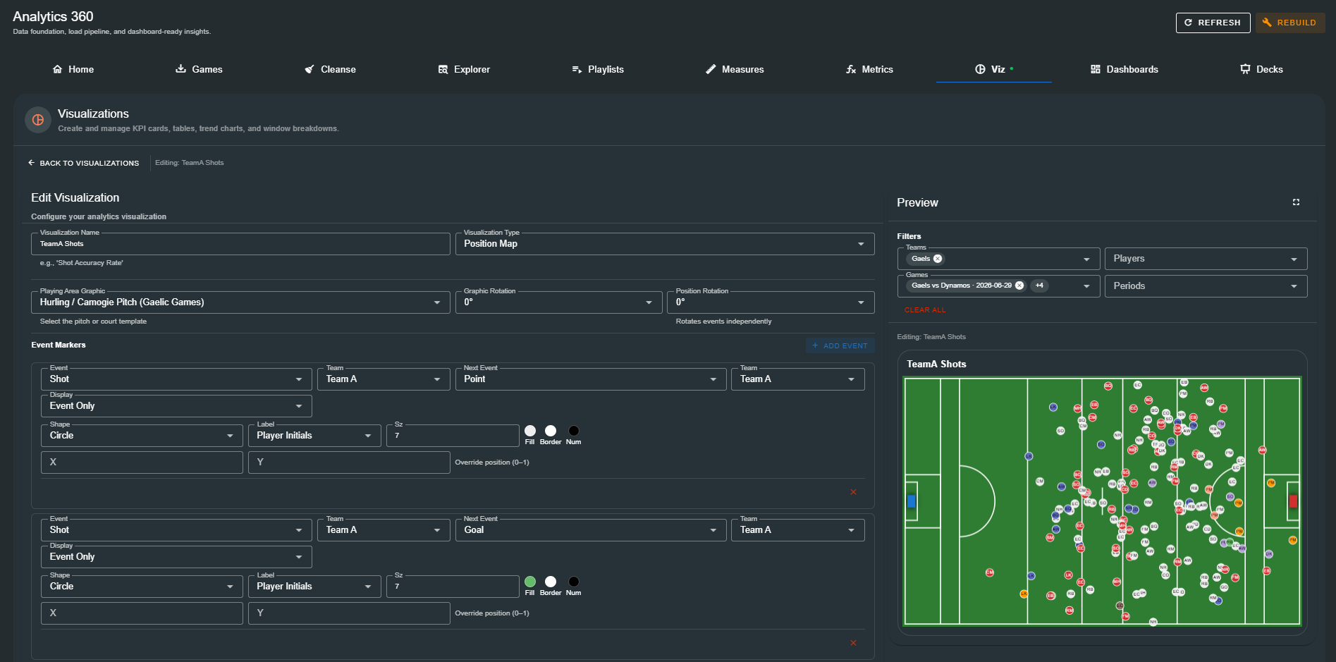
Configuration
| Setting | Description |
|---|---|
| Playing Area | Select from the catalog of sports fields/pitches/courts. |
| Graphic Rotation | Rotate the entire graphic (0°, 90°, 180°, 270°). |
| Position Rotation | Rotate event positions relative to the graphic. |
Event Definitions
Each event definition configures which events to display and how:
| Setting | Description |
|---|---|
| Event Name | The event type to display (e.g. "Shot", "Puckout"). |
| Next Event Name | An optional linked event for connected display modes. |
| Event Team | Filter by Team A, Team B, or any team. |
| Next Event Team | Team filter for the linked event. |
| Display Mode | Event (show only the event), Next Event (show only the next event), Both (show both), Connected (show both with a line). |
| Colour | Marker fill colour. |
| Shape | Circle, square, triangle, or pentagon. |
| Size | Marker radius in pixels. |
| Player Label | None, number, or initials overlay on the marker. |
Clicking any marker opens the clip player to review the video footage for that event.
Position maps can be auto-generated from the Tagger game configuration during analytics loading when the Auto-Load Config sync option is enabled. :::
Event Source Visualization
An event source visualization answers the question: "Where do our scoring chances come from?" It maps source events (e.g. puckouts, turnovers) to target events (e.g. scores, shots) and displays the breakdown.
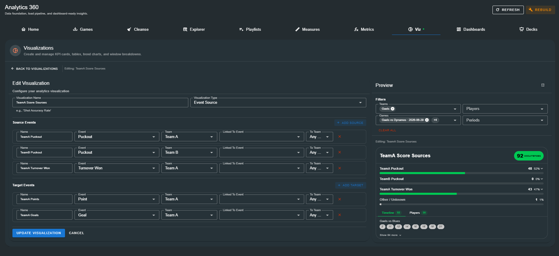
Configuration
Source Events — Define one or more entry points:
| Field | Description |
|---|---|
| Name | A human-readable label (e.g. "TeamA Puckout"). |
| Event | The source event type. |
| Team | Team filter for the source event. |
| Linked To Event | An optional chained event between source and target. |
| To Team | Team filter for the linked event. |
Target Events — Define one or more end points:
| Field | Description |
|---|---|
| Name | A human-readable label (e.g. "Score"). |
| Event | The target event type. |
| Team | Team filter for the target event. |
| Linked To Event | An optional chained event. |
| To Team | Team filter for the linked event. |
Display
The rendered visualization shows:
- Total occurrences count in a prominent badge
- Source breakdown — horizontal bars for each source event with count and percentage
- Timeline tab — minute markers as coloured chips for quick scanning, grouped by game
- Players tab — player involvement word cloud with counts, tiered by size (top third large, middle third medium, bottom third small). Click a player to expand their specific occurrence timeline.
- Two-team layouts split player involvement into side-by-side columns with a vertical divider
Click any occurrence chip to open the clip player for video review.
Filters
Every visualization has its own set of filters, configured separately from the global Analytics 360 scope. Filters are applied when the visualization renders.
| Filter | Description |
|---|---|
| Teams | Restrict to events from specific teams. Leave empty to include all. |
| Games | Restrict to specific games. Automatically filtered to the selected teams' games when teams are selected. |
| Players | Restrict to events involving specific players. |
| Periods | Restrict to specific periods (e.g. 1st half only). |
Filters can also be applied on-the-fly in the Preview panel and in the Fullscreen Preview dialog without modifying the saved visualization.
Preview
Inline Preview
The right panel of the editor shows a live preview of the visualization as you configure it. The preview updates in real time as you change settings, so you can see exactly how the visualization will look before saving.
Row Preview
Click Preview from the list view actions menu (or the preview button) to open a row preview dialog with the visualization rendered at full width and filter controls for quick data exploration.
Fullscreen Preview
Click the expand button in the preview panel to open a fullscreen dialog with:
- Zoom controls — Zoom in (up to 200%), zoom out (down to 50%), and reset
- Export — Download as PNG, SVG, or PDF
- In-dialog filters — Teams, Players, Games, and Periods filters applied on-the-fly
The fullscreen preview is the recommended way to review visualizations before adding them to a dashboard or deck. It renders at full resolution and supports export for sharing outside the application. :::
Managing Visualizations
Editing
Click any row in the list view, or use the kebab menu (⋮) → Edit, to open the visualization in the editor. Make your changes and click Update Visualization.
Copying
Use the kebab menu (⋮) → Copy to duplicate a visualization. The editor opens with a clone named "Original Name (Copy)" — make adjustments and save to create a variant.
Deleting
Use the kebab menu (⋮) → Delete to remove a visualization. Analytics 360 checks whether the visualization is referenced by any dashboards or decks before allowing deletion. If the visualization is in use, the dialog lists every consumer and blocks the deletion until those references are removed.
Bulk Delete
Check multiple rows in the list view and click Delete Selected (n). The dependency check runs against all selected visualizations — any that are in use are listed with the blocking consumers, and only the safe-to-delete visualizations are removed.
Searching and Filtering
- Search bar — Filters visualizations by name in real time.
- Type filter — Toggle between All, KPI, Table, Chart, Map, and Event Source to narrow the list.
How Visualizations Connect
Visualizations are the consumer layer of the Analytics 360 data model — they surface measures and calculated metrics as visual outputs:
Tagged Events  →  Measures  →  Calculated Metrics  →  Visualizations  →  Dashboards
                                                                    →  Decks
A single visualization can appear in multiple dashboards and decks. A single measure or calculated metric can power multiple visualizations of different types — for example, a shot success rate metric can drive a KPI card, a bar chart by game, and a table of player-by-player rates simultaneously.
Next Steps
With visualizations defined, you are ready to assemble them into higher-level outputs:
- Dashboards — Arrange visualizations into structured, resizable dashboard layouts
- Decks — Build presentation decks combining visualizations with narrative slides